Mobile First Design Principles: The Complete 2025 Guide to Creating User-Centric Websites

Pie chart showing mobile traffic accounts for 60% of web usage in 2025

Mobile devices now account for over 60% of global web traffic, making mobile first design principles more critical than ever for creating successful websites. As we navigate through 2025, businesses that fail to prioritise mobile user experience risk losing significant market share to competitors who understand the importance of mobile-centric design approaches.

The mobile-first methodology represents a fundamental shift in how we approach web design, moving away from the traditional desktop-first mentality that dominated the early web. This approach prioritises the mobile user experience from the initial design phase, ensuring that websites function flawlessly on smaller screens before scaling up to larger displays.

In this comprehensive guide, we’ll explore the essential mobile first design principles that every web designer and business owner needs to understand in 2025. From responsive design best practices to accessibility guidelines and performance optimisation strategies, you’ll discover how to create websites that not only meet but exceed modern user expectations across all devices.

Pie chart showing mobile traffic accounts for 60% of web usage in 2025

Understanding Mobile First Design Principles

Mobile first design principles represent a paradigm shift in web development, where designers begin the creative process by focusing on the mobile user experience before considering desktop layouts. This approach ensures that the most critical content and functionality are prioritised for users onsmaller screens, who often face limitations in bandwidth, processing power, and screen real estate.

The core philosophy behind mobile-first design stems from the constraint-driven creativity principle. When designers are forced to work within the limitations of mobile devices, they naturally focus on what’s truly essential, eliminating unnecessary elements that can clutter the user experience. This results in cleaner, more focused designs that benefit users across all device types.

Key mobile first design principles include progressive enhancement, content prioritisation, and touch-first interaction design. Progressive enhancement means starting with a basic, functional mobile experience and then adding enhanced features for larger screens and more powerful devices. Content prioritisation involves identifying the most important information and actions users need to accomplish, ensuring these elements are prominently featured and easily accessible on mobile devices.

Touch-first interaction design recognises that mobile users primarily interact through touch gestures rather than mouse clicks. This principle influences everything from button sizing and spacing to navigation patterns and form design. Elements must be large enough for finger taps, spaced adequately to prevent accidental clicks, and positioned within comfortable reach zones for one-handed operation.

The mobile-first approach also emphasises performance optimisation from the ground up. Mobile devices often operate on slower networks and have limited processing capabilities, making fast-loading, efficient designs essential for user retention and satisfaction.

Infographic illustrating mobile-first design workflow from mobile to desktop

Essential Responsive Web Design Best Practices

Responsive web design best practices in 2025 focus on creating fluid, adaptable layouts that provide optimal viewing experiences across the entire spectrum of devices. The foundation of effective responsive design lies in flexible grid systems that use relative units like percentages and viewport units rather than fixed pixel measurements.

Modern CSS Grid and Flexbox technologies have revolutionised how designers approach responsive layouts. CSS Grid excels at creating complex, two-dimensional layouts that adapt seamlessly to different screen sizes, while Flexbox handles one-dimensional layouts and component-level responsiveness with remarkable efficiency. Together, these technologies eliminate the need for complicated float-based layouts and provide more intuitive control over responsive behaviour.

According to recent studies, more than 50% of Internet traffic comes from mobile devices, and that number is expected to rise. This statistic underscores the importance of implementing responsive design strategies that prioritise mobile performance while maintaining desktop functionality.

Breakpoint strategy has evolved significantly, with designers now focusing on content-driven breakpoints rather than device-specific ones. Instead of designing for specific screen sizes like “iPhone” or “iPad,” modern responsive design identifies natural breaking points where content becomes difficult to read or navigate, then adjusts the layout accordingly.

Image optimisation plays a crucial role in responsive design success. Implementing responsive images using the srcset attribute and picture element ensures that users receive appropriately sized images for their devices, reducing bandwidth usage and improving loading times. WebP and AVIF formats offer superior compression ratios compared to traditional JPEG and PNG formats, resulting in faster page loads without sacrificing visual quality.

Typography responsiveness extends beyond simple font-size adjustments. Modern approaches use fluid typography with CSS clamp() functions to create smooth scaling between minimum and maximum font sizes, ensuring optimal readability across all devices without requiring multiple breakpoint declarations.

Web Design Accessibility Guidelines for Mobile

Web design accessibility guidelines for mobile devices require special consideration due to the unique challenges posed by smaller screens, touch interactions, and varying user capabilities. The Web Content Accessibility Guidelines (WCAG) 2.1 and the emerging WCAG 3.0 standards provide comprehensive frameworks for creating inclusive mobile experiences.

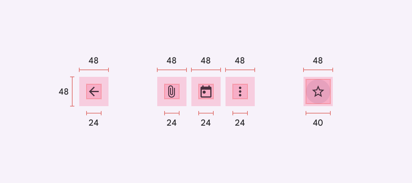
Touch target sizing represents one of the most critical accessibility considerations for mobile design. The minimum recommended touch target size is 44×44 pixels, but best practices suggest 48×48 pixels to accommodate users with motor disabilities or those using devices while in motion. Interactive elements should also maintain adequate spacing (at least 8 pixels) to prevent accidental activation of adjacent controls.

Diagram showing proper touch target sizes and spacing for mobile accessibility
Credit: Tetralogical

Colour contrast requirements become more stringent on mobile devices due to varying lighting conditions and screen capabilities. While WCAG requires a minimum contrast ratio of 4.5:1 for normal text and 3:1 for large text, mobile environments often benefit from higher contrast ratios to maintain readability in bright sunlight or low-light conditions.

Screen reader compatibility on mobile devices requires careful attention to semantic HTML structure and appropriate ARIA labels. Mobile screen readers like VoiceOver on iOS and TalkBack on Android have specific interaction patterns that differ from desktop screen readers. Designers must ensure that swipe gestures, touch explorations, and voice commands work seamlessly with their responsive designs.

Navigation accessibility becomes particularly challenging on mobile devices where traditional hover states don’t exist. Skip navigation links, landmark roles, and logical heading structures become essential for users who navigate using assistive technologies. Focus management during page transitions and modal interactions requires special attention to prevent users from becoming lost in the interface.

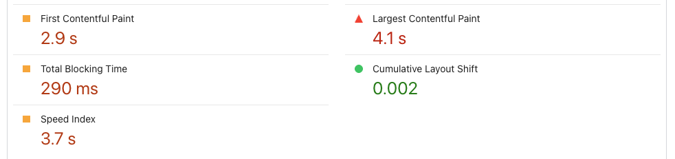
Font sizing and line height adjustments must account for users with visual impairments who may need to zoom content up to 200% without losing functionality or readability. This requirement influences layout decisions and necessitates thorough testing across various zoom levels and orientation changes.

Website Loading Speed Optimization Strategies

Website loading speed optimisation for mobile devices requires a multi-faceted approach that addresses the unique constraints of mobile networks and hardware limitations. Core Web Vitals have become crucial ranking factors, with Largest Contentful Paint (LCP), First Input Delay (FID), and Cumulative Layout Shift (CLS) directly impacting both user experience and search engine rankings.

Critical rendering path optimisation focuses on identifying and prioritising the resources necessary for above-the-fold content rendering. This involves inlining critical CSS, deferring non-essential JavaScript, and optimising the order in which resources are loaded. The goal is to achieve sub-3-second loading times, as studies show that 53% of mobile users abandon pages that take longer than three seconds to load.


Image optimisation strategies have evolved beyond simple compression techniques. Modern approaches include implementing lazy loading for below-the-fold images, using next-generation formats like WebP and AVIF, and employing responsive image techniques that serve appropriately sized images based on device capabilities. Content Delivery Networks (CDNs) with edge optimisation can reduce image loading times by up to 50% for global audiences.

JavaScript optimisation involves techniques like code splitting, tree shaking, and implementing efficient bundling strategies. Service workers can cache critical resources and enable offline functionality, providing users with immediate access to previously visited content even on unreliable mobile networks.

Database and server optimisation plays a crucial role in mobile performance. Implementing efficient caching strategies, optimising database queries, and using modern hosting solutions with SSD storage and HTTP/2 support can significantly improve Time to First Byte (TTFB) metrics.

Third-party script management requires careful consideration, as external resources can significantly impact mobile performance. Implementing resource hints like dns-prefetch, preconnect, and preload can optimise the loading of essential third-party resources while lazy loading non-critical scripts to minimise their impact on initial page rendering.

Modern Web Design Trends Enhancing Mobile Experience

Modern web design trends in 2025 are heavily influenced by the need to create exceptional mobile experiences that leverage the latest technological capabilities. After years of excessive animation and 3D elements dominating the web design trends, 2025 marks a shift toward more intentional and refined motion design, focusing on purposeful interactions that enhance rather than distract from the user experience.

Progressive Web Apps (PWAs) have matured into a mainstream solution for delivering app-like experiences through web browsers. PWAs combine the accessibility of websites with the functionality of native mobile applications, offering features like offline functionality, push notifications, and home screen installation. This technology bridges the gap between web and mobile app experiences while maintaining the universal accessibility of web technologies.

Voice User Interface (VUI) integration represents a growing trend as smart speakers and voice assistants become more prevalent. Modern web designs are incorporating voice navigation options, voice search capabilities, and audio feedback systems that enhance accessibility while providing alternative interaction methods for users in various contexts.

Gesture-based navigation has evolved beyond simple swipe interactions to include more sophisticated multi-touch gestures, pinch-to-zoom controls, and context-sensitive gesture recognition. These interfaces provide intuitive interaction patterns that feel natural on mobile devices while reducing the need for traditional button-based navigation.

AI-powered personalization enables websites to adapt their content, layout, and functionality based on user behavior patterns, device capabilities, and contextual information. Machine learning algorithms can optimize loading priorities, customize content presentation, and even adjust interface elements in real-time to improve individual user experiences.

Dark mode implementation has become a standard expectation rather than a luxury feature. Beyond aesthetic preferences, dark mode provides practical benefits for mobile users, including reduced eye strain in low-light conditions and improved battery life on OLED displays. Modern implementations use CSS custom properties and JavaScript to provide seamless theme switching while maintaining accessibility standards.

Conclusion

The mobile first design principles outlined in this guide represent essential strategies for creating successful websites in 2025 and beyond. As mobile traffic continues to dominate web usage patterns, businesses and designers who embrace these principles will be better positioned to meet user expectations and achieve their digital objectives.

The key takeaways from our exploration include the importance of starting with mobile constraints to drive focused design decisions, implementing responsive design best practices that truly adapt to user needs, ensuring accessibility compliance across all devices, optimising performance for mobile networks and hardware, and incorporating modern trends that enhance rather than complicate the user experience.

The future of web design lies in creating seamless, inclusive experiences that work flawlessly across all devices and user capabilities. By implementing these mobile first design principles, you’ll create websites that not only meet current user expectations but are also positioned to adapt to future technological developments and changing user behaviours.

Ready to transform your web design approach? Start by auditing your current website’s mobile performance using tools like Google PageSpeed Insights and Mobile-Friendly Test. Identify areas where mobile-first principles can improve user experience, then gradually implement the strategies outlined in this guide. Your users—and your business metrics—will thank you for prioritising their mobile experience.

Scroll to Top